UPDATE: Einstein Analytics was renamed to Tableau CRM in 2020
This post is part of a series that is exploring the capabilities and limitations of various data visualization tools when embedded in Salesforce.
In the previous post, we used native Salesforce report charts to embed a visualization on an Account record. There were a lot of advantages to that approach, but also some limitations, primarily in limited chart types and the lack of ability to handle large data volumes from multiple sources with flexible data models.
If your project has one of these requirements, the next easiest solution is to use Salesforce’s analytics product called Einstein Analytics (Tableau CRM).
Prerequisites
- Salesforce org with Einstein Analytics (Tableau CRM) enabled and populated with data you want to visualize; the example below uses data from the account and opportunity objects. You can create a free developer edition org with Einstein Analytics (Tableau CRM) licenses that is pre-populated with data using this link.
Step 1: Create a Dataset in Einstein Analytics (Tableau CRM)
In this example we are going to use Opportunity data and need to extract that dataset from Salesforce into Einstein Analytics (Tableau CRM).
The Salesforce org you signed up for using the link in the prerequisites section comes with Analytics enabled and the Salesforce org is pre-loaded with test data.
Open the App Launcher and click the tile for Analytics Studio. Click the Create button and select “Dataset”. Select the Salesforce option and click the Continue button. Name the data set “Opportunities with Accounts” and add it to the Default Salesforce Dataflow.
This will open the dataset builder canvas. Select Opportunity as the root object. Hover over Opportunity and click the plus sign to see the fields and relationships. Check the box next to the following fields
- Amount
- Close Date
- Name
- Opportunity ID
- Stage
On the Relationships tab click the “Join” icon next to Account ID. This will add the Account object to the canvas. Select the following fields for Account:
- Account ID
- Account Name
Click the Next button at the bottom of the canvas. Add the dataset to an app (doesn’t really matter which for this example) and click Create Dataset. Salesforce will begin building the dataset automatically. You can monitor the status by clicking on the “Go to the data monitor” link.
Step 2: Create a Dashboard in Analytics Studio
As of the Summer ’18 release, only the Wave Dashboard lighting component is available out of the box for embedding Einstein Analytics (Tableau CRM) visualizations on record pages. So that’s the approach we use here.
Open the App Launcher and click the tile for Analytics Studio. Find the dataset we just created called “Opportunities with Accounts” and open it. This will create a new lens based on that data set.
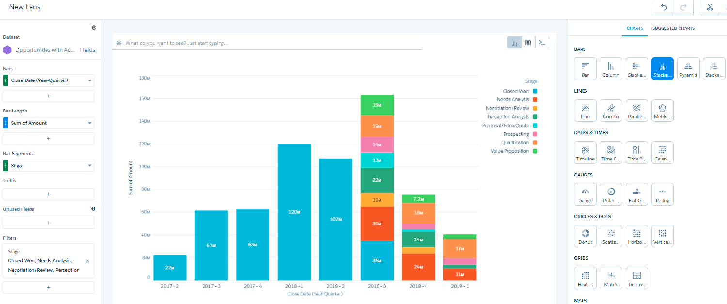
Make the following changes to the chart settings:
- Change the chart type to Stacked Bars
- Set Bar Length to Sum of Amount
- Add a Bar for Close Date and group by Year-Quarter
- Add a Bar Segment for Stage
- Add a Filter for Stage and keep all values except “Close Lost”
Your lens should looks something like this
Save the lens with the name SampleRevenuePipeline. In the top right corner click the scissors icon (Clip to Designer) and enter “Revenue Pipeline Stacked Bar” as the Query Label. Click the “Clip to Designer” button to open a new dashboard canvas.
Drag the query you just created onto the Dashboard canvas and expand it so that it occupies the length of the canvas. Resize as needed until is looks good. Save the dashboard and name it “Sample Revenue Pipeline Dashboard”.
Step 3: Embed and Filter the Dashboard on Salesforce Records in Lightning Experience
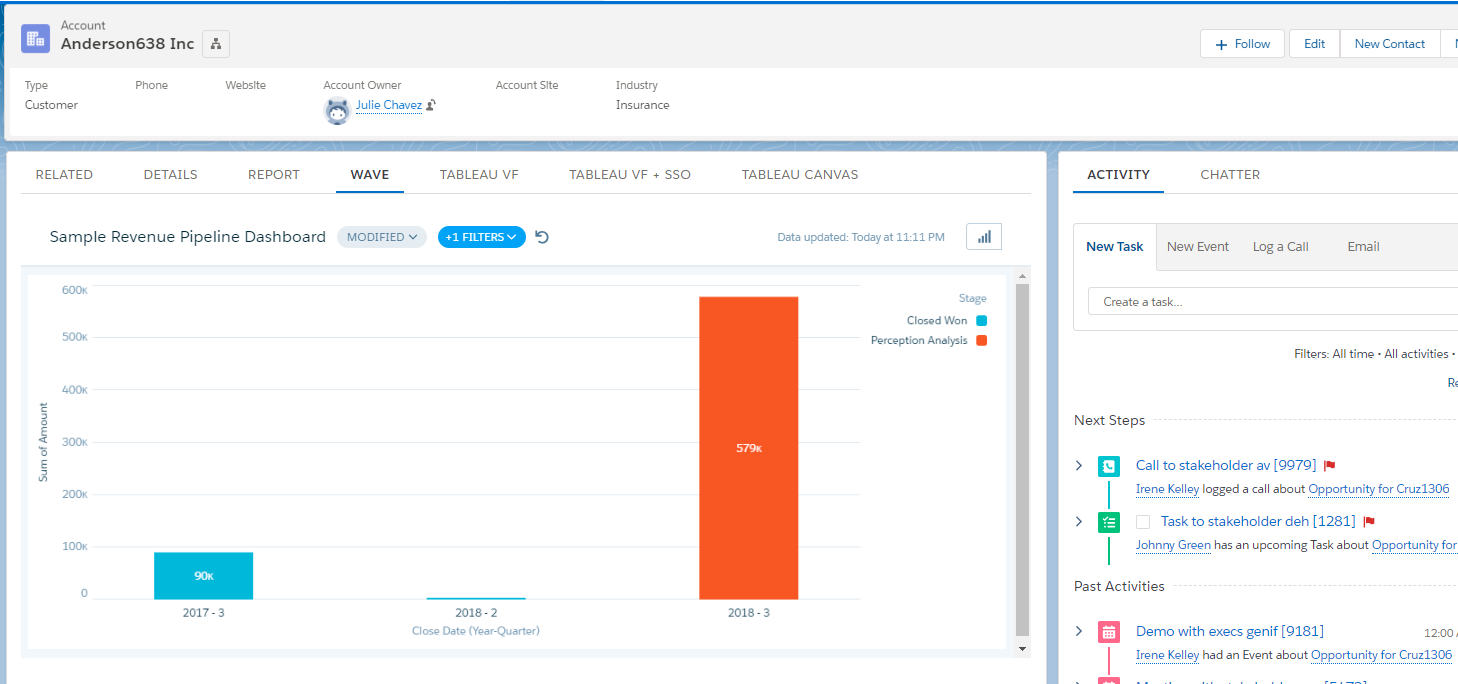
It’s helpful to see the opportunity pipeline across all accounts, but what if account managers want to see this chart filtered automatically when looking at a specific account record in Salesforce? To achieve this, we are going to use a standard lighting component that displays and filters the dashboard to only show pipeline data specific to the account record being viewed.
Navigate to an Account record in your Salesforce org. Click the gear icon in the top right and select “Edit Page”. This will open the Account Record Page editor in the Lightning App Builder. Click the Tabs component, then the Add Tab button in the right pane. Select “Custom” and enter “Wave” for the Tab Label.
Click the Wave tab, then drag the Wave Dashboard component from the list of Lightning Components onto the page. In the right pane, select the “Sample Revenue Pipeline Dashboard” dashboard. Set the following additional values
- Height: 500
- Filter: {‘datasets’:{‘Opportunities_with_Accounts’:[{‘fields’:[‘AccountId’], ‘filter’:{‘operator’: ‘matches’, ‘values’:[‘$Id’]}}]}}
- Show Header: false
Leave the rest of the default settings. Save the Account Record Page and then view an account record to see the filtered chart.
Summary
Advantages of this approach include:
- Effort and skills required: Einstein Analytics (Tableau CRM) is a robust tool and harder to learn than Salesforce reports and dashboards, but definitely very accessible. If you are savvy with Excel or other data manipulation tools, you’ll pick it up quickly.
- Multiple devices: The standard lighting component used in this example is responsive and looks good on a variety of screen sizes. Custom record page tabs can also be created for the mobile layout. Salesforce also has a standalone Analytics app that can be used to view and interact with the information on the go and is tightly integrated with the main Salesforce mobile app.
- Single sign-on: Since the Analytics product is native to the platform, Salesforce users with feature licenses have access to the visualizations automatically.
- Data security: Einstein Analytics (Tableau CRM) includes functionality for defining row-level security for datasets. In addition, when Salesforce is the source data for the dashboard there is an option for Analytics to “inherit” security from Salesforce. This is a pretty unique feature in this space.
- Deployment process: Analytics metadata are supported via change sets and metadata API deployments so can be easily integrated into the Salesforce application development process.
- Look and feel: There are a lot more chart types and options for customizing the styling and layout of charts and dashboards.
- Large data volumes: Einstein Analytics (Tableau CRM) can handle very high data volumes.
- Data sources: At the time of writing this post, Salesforce supports around a dozen connectors to various data sources.
- Data model: Data flows and recipes provide robust functionality for restructuring and enhancing the data model to support visualization needs.
There are several limitations to consider with Einstein Analytics (Tableau CRM):
- Accuracy of data: The flip side of being able to handle very large data volumes is that the data is not queried from the CRM in real-time. Datasets in Einstein Analytics (Tableau CRM) are updated up to every hour so embedded visualizations may not be totally accurate, but hourly is pretty close.
- Look and feel: While the options for presenting information are sufficient for many organizations, Einstein Analytics (Tableau CRM) offers fewer chart types than other solutions.
- Data sources: While Einstein Analytics (Tableau CRM) provides out of the box options for connecting to various data sources, there are not as many connectors as other solutions provide.
Next post: Embed Tableau Dashboard in Salesforce Records Using Visualforce
Resources
- Trailhead: Get to Know Your Analytics Home
- Trailhead: Extract Salesforce Data into Analytics
- Salesforce documentation: Lightning App Builder
- Salesforce documentation: Tableau CRM Dashboards in Lightning Pages


Hi,
I used the same steps but when using the filter the Dashboard component is throwing an error.
I changed the Dataset name to my dataset and tried different value for AccountId.Id when AccountId was not working but still facing an error. Any ideas?
Thanks.