This post is part of a series that is exploring the capabilities and limitations of various data visualization tools when embedded in Salesforce.
This is an example of how to use Qlik Sense Desktop to display and filter a Qlik visualization on record pages in Lightning Experience.
Prerequisites
- Qlik Sense Enterprise: In order to fully complete the required steps, you must have admin access to Qlik Sense Enterprise (also known as Qlik Sense Server). You can use Qlik Sense Desktop to try out most of the steps. Note that Qlik Sense Desktop only runs on Windows.
- Salesforce org populated with data you want to visualize; the example below uses data from the account and opportunity objects. You can create a free developer edition org that is pre-populated with data using this link.
Step 1: Create Dashboard in Qlik Sense Desktop
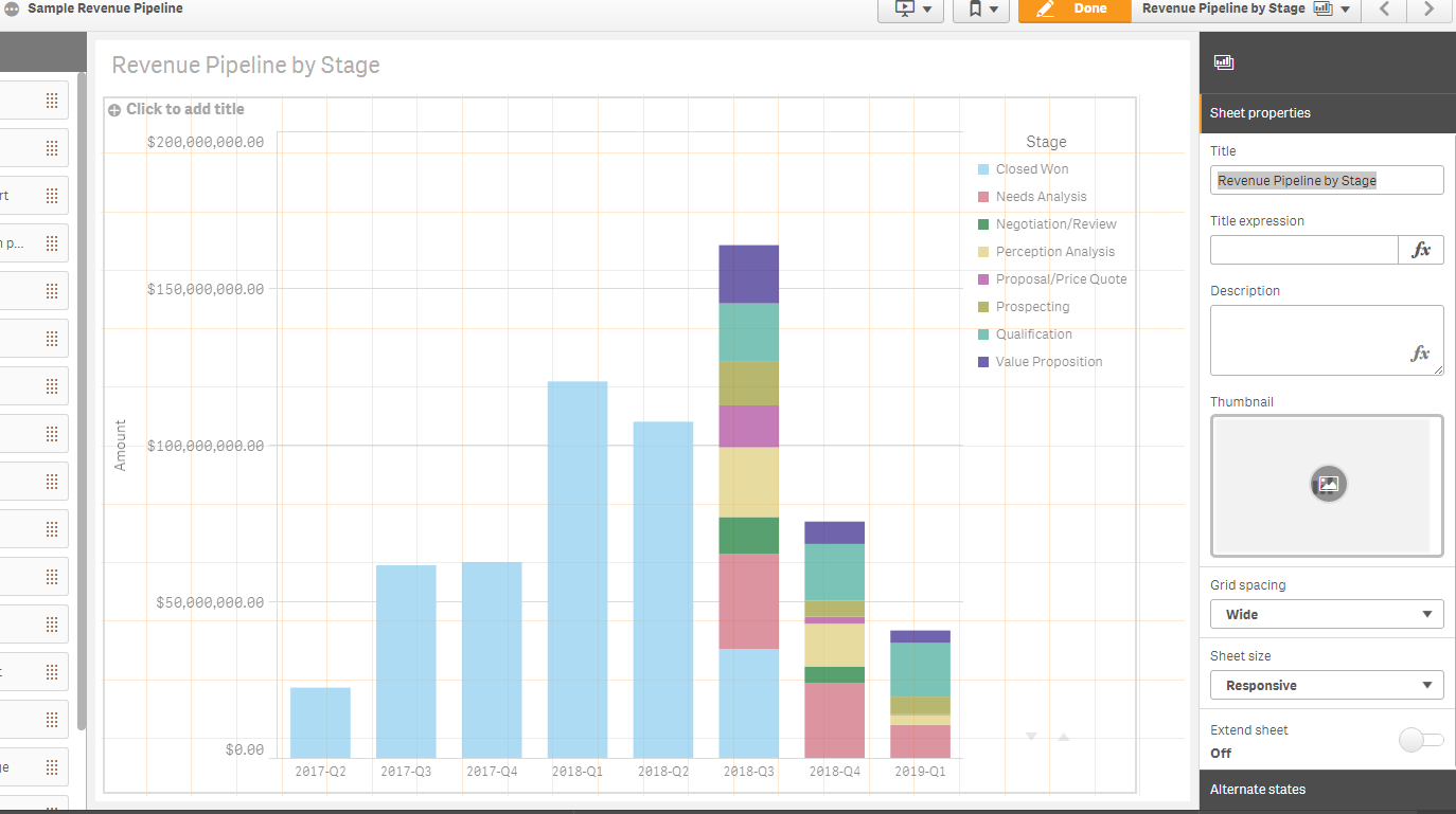
Launch Qlik Sense Desktop and click the “Create new app” button. Name the app “Sample Revenue Pipeline”, then create and open the app.
Select the option to “Add data from files and other sources” and select the Salesforce option. Enter the credentials for the Salesforce org with the test data (for example the org created in the prerequisites section). In the Tables pane, select the Opportunity table and click the “Add data” button.
This should take you to a new sheet in the app. Click the “Edit” button at the top right to start editing the sheet. Click on the Charts pane and drag the Bar chart onto the sheet. Add the following dimensions and measures:
- Click “Add dimension”. Select CloseDate.YearQuarter for the dimension. The expression for the field should be
=[CloseDate.autoCalendar.YearQuarter]. Change the label to “Close Date”. - Click “Add measure” and select Amount(Sum) as the measure. Change the label to “Amount”.
- Add another dimension by clicking “Add” in the Data -> Dimensions section of the chart editor pane on the right side. Select StageName as the additional dimension. Change the label to “Stage”. Filter out the lost opportunities by changing Field to the following expression
=IF (StageName <> 'Closed Lost', StageName, null())
Finally, let’s fix up the display of the chart. Open the Appearance section of the chart editor pane and make the following edits
- In Presentation, select the “Stacked” option
- In X-axis, select “Labels only” in the Labels and title setting
Edit the sheet properties and give the sheet the following name: Revenue Pipeline by Stage. Your visualization should look something like this:
Step 2: Publish the Dashboard Online
Qlik Sense Enterprise
Normally you would publish the app to an online Qlik Sense environment, such as your Qlik Sense Server environment.
Qlik Sense Desktop
For the purposes of this example we will access a web-based version of the visualization using localhost.
You can view a web-enabled version of the visualization by opening the Single configurator tool in the Qlik Dev Hub, which we are going to do shortly. The issue with using localhost as the server for the visualization is that outside servers, such as Salesforce, don’t have access to the content. There are a number of ways to make a local server available to the Internet. For this example we will use a tunneling service called ngrok because it is simple to set up.
Download ngrok and unzip and save the download in a location that is convenient for you. Open a terminal or command prompt and navigate to the folder where you unzipped the ngrok download. Next we need to start a tunnel on the port where the Qlik Sense local server is running. Use the following command:
./ngrok http 4848
The ngrok service will run in the terminal and will display URLs you can use to access the local Qlik Sense server from the Internet.
Copy the ngrok URL for http, which looks something like this: http://randomcharaters.ngrok.io. Note that we will refer to this URL as “ngrok URL” later.
Make sure you terminate the ngrok service after you finish completing the steps below by typing Ctrl+c in the terminal.
Step 3: Set up Single Sign-on Authentication from Salesforce to Qlik Sense Enterprise
Set up SAML SSO with Salesforce as the identity provider so that users can see the embedded visualization from the Salesforce record page.
I skipped this step since I didn’t have access to Qlik Sense Enterprise/Server, but you can follow these instructions to complete this setup.
Step 4: Configure the Embed URL Using the Single Configurator
Next we need to get the URL that we can use to embed the visualization. Launch the Dev Hub from Qlik Sense Desktop. The Dev Hub will open in your default browser.
Navigate to the Single configurator tool. Select the “Sample Revenue Pipeline” app in the drop down and then the Revenue Pipeline by Stage sheet. Copy the value in the URL field starting with “/single/?appid=…” to the end of the URL. Note that we will refer to this URL as “Qlik Sense Single Object URL” below.
Step 5: Embed and Filter the Dashboard in Salesforce Lightning Experience Records
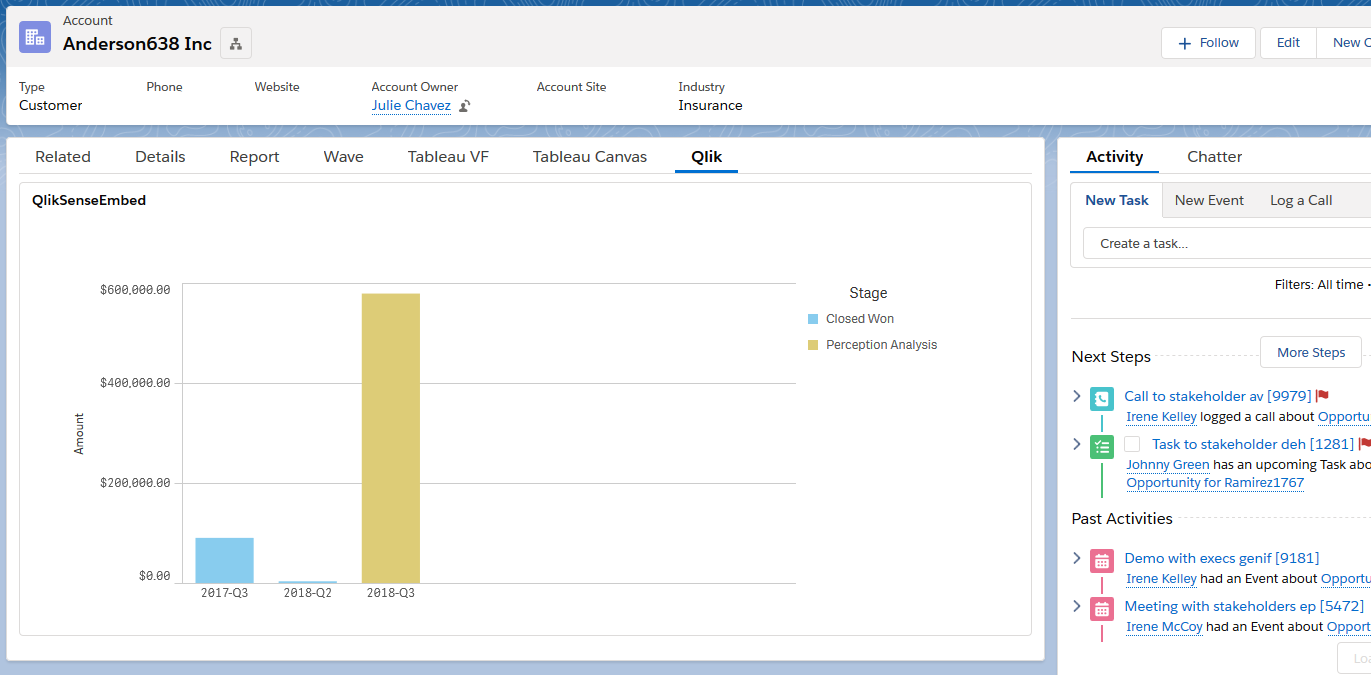
Create a new Visualforce page by Navigating to Salesforce Setup, search for and open “Visualforce Pages”. Click the “New” button, enter “QlikSenseEmbed” for the name and check the box “Available for Lightning Experience, Lightning Communities, and the mobile app”. Replace the placeholder code with the code below.
<apex:page standardController="Account" showheader="false" sidebar="false">
  <apex:iframe src="[ngrok URL][Qlik Sense Single Object URL]&select=AccountId,{!Account.Id}" height="400px" width="100%" frameborder="0">
  </apex:iframe>
</apex:page>
Note that if you are hosting your visualization with Qlik Sense Enterprise and have set up SAML SSO, then you should use the full URL provided by the Single configurator tool, instead of the URL in the code above.
Now we need to customize the Account record page to show the visualization. Navigate to an Account record in your Salesforce org. Click the gear icon in the top right and select “Edit Page”. This will open the Account Record Page editor in the Lightning App Builder. Click the Tabs component, then the Add Tab button. Select “Custom” for the Tab Label and enter “Qlik” for the Custom Tab Label.
Click the Qlik tab, then drag Visualforce component from the list of Lightning Components onto the page. In the right pane, select QlikSenseEmbed for the Visualforce Page Name and set the Height to 400. Save the Account Record Page and then view an account record to see the filtered visualization.
Summary
I wasn’t able to gain access to Qlik Sense Server/Enterprise to test all of the features required for embedded analytics. Qlik Sense Desktop and the included Dev Hub application provide a lot of nice utilities for developers, but without having access to an environment to host the visualizations, it felt like there were more barriers to entry than with other companies.
Advantages of this approach include:
- Multiple devices: Qlik Sense provides a number of features for design responsive layouts when creating visualizations. This needs to be specified in Qlik Sense, rather than in the Salesforce application. Custom lightning record pages can also be created for a mobile form factor, and Visualforce pages can be embedded in mobile cards or in page layouts and viewed in the Salesforce mobile app.
- Look and feel: There are a lots of chart types and options for customizing the styling and layout of charts and dashboards.
- Large data volumes: Qlik Sense Enterprise can handle very large data volumes.
- Data sources: Qlik Sense supports many connectors to various data sources and data formats, though not as many as some other BI systems, such as Tableau.
- Data model: Qlik Sense provides robust functionality for restructuring and enhancing the data model to support visualization needs.
There are some limitations with this approach
- Effort and skills required: Qlik Sense Desktop is a robust tool and harder to learn than Salesforce reports and dashboards, but definitely very accessible. If you are savvy with Excel or other data manipulation tools, you’ll pick it up quickly. This approach also requires very little Visualforce knowledge and creating the UI mashup is pretty simple. Much of the customization is achieved using Qlik Sense expressions, which have a similar syntax as Excel formulas. I wasn’t able to gain access to Qlik Sense Enterprise and was a bit disappointed that many of the features need to embedded analytics aren’t available in their cloud offerings. Setting up Qlik Sense Enterprise/Server looks like a fairly significant undertaking.
- Accuracy of data: The flip side of being able to handle very large data volumes is that the data is not queried from the CRM in real-time. Data in BI systems are updated at a set frequency and the data sync’ing capabilities of Qlik Sense Enterprise may not meet your requirements.
- Data security: Any Salesforce data security settings, such as object and field level security and record-level sharing, are not transferred by default to Qlik Sense visualizations. If your data security model is pretty open, this might not be an issue. For other scenarios, especially embedding in external-facing application pages, re-creating the field and row-level security in Qlik Sense could be a significant effort.
- Deployment process: Source data, worksheets and dashboards are created in Qlik Sense Desktop, then pushed to Qlik Sense Server/Enterprise and live separate from the Salesforce platform. The process for creating/updating embedded assets needs to be coordinated with the process for creating/updating the application page in which they are embedded.
Next post: Embed Power BI Reports in Salesforce Records using Visualforce
Resources
- Qlik Tutorial: Download and Install Qlik Sense Desktop
- Qlik Tutorial: Create Your First App & Visualization with Qlik Sense Desktop
- Qlik Tutorial: Launch Dev Hub from Qlik Sense Desktop
- Ngrok documentation
- Salesforce documentation: Lightning App Builder


Can I get access to the qlik config video?
Hi Bill,
It looks like the owner of the video has made it private, so I removed it from the list of resources. I found another video that covers similar topics that might be helpful for you: https://www.youtube.com/watch?v=dRAfOLBG2zw