This post is part of a series that is exploring the capabilities and limitations of various data visualization tools when embedded in Salesforce.
This is a look at how to use native Salesforce reports to display a visualization on record pages in Lightning Experience.
Prerequisites
- Salesforce org populated with data you want to visualize; the example below uses data from the account and opportunity objects. You can create a free developer edition org that is pre-populated with data using this link.
Step 1: Create a Report Chart in Salesforce
As of the Summer ’18 release, only the Report Chart lighting component is available out of the box for embedding visualizations on record pages. So that’s the approach we use here.
Navigate to the Reports tab in Salesforce and create a new report based on the standard “Opportunities” report type.
Use the following filters:
- Show Me = All opportunities
- Close Date = All Time
- Opportunity Status = Any
- Probability = All
- Stage = (deselect “Closed Lost” and leave the rest of the stage values checked)
In the Outline pane, group rows by Close Date and and group columns by Stage. Make sure that Amount is added as one of the columns. Click the down arrow in the Amount column, then select Summarize -> Sum.
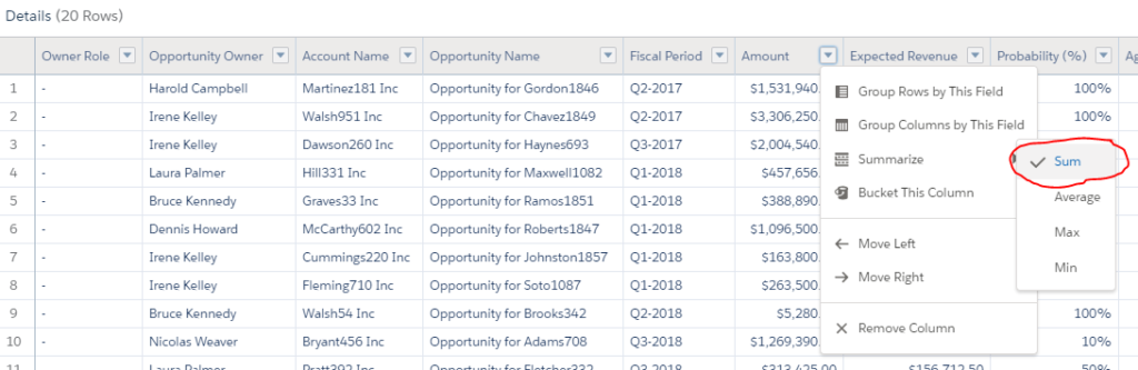
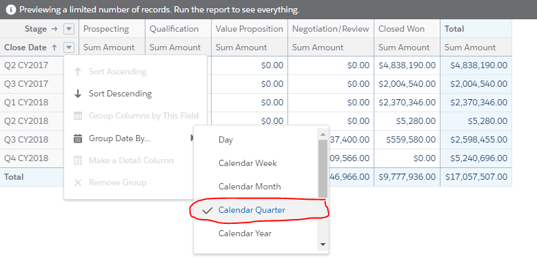
At the bottom of the report, toggle the option to turn off Detail Rows. In the data summary table that is still visible, click the down arrow next to Close Date, then select Group Date By… -> Calendar Quarter.
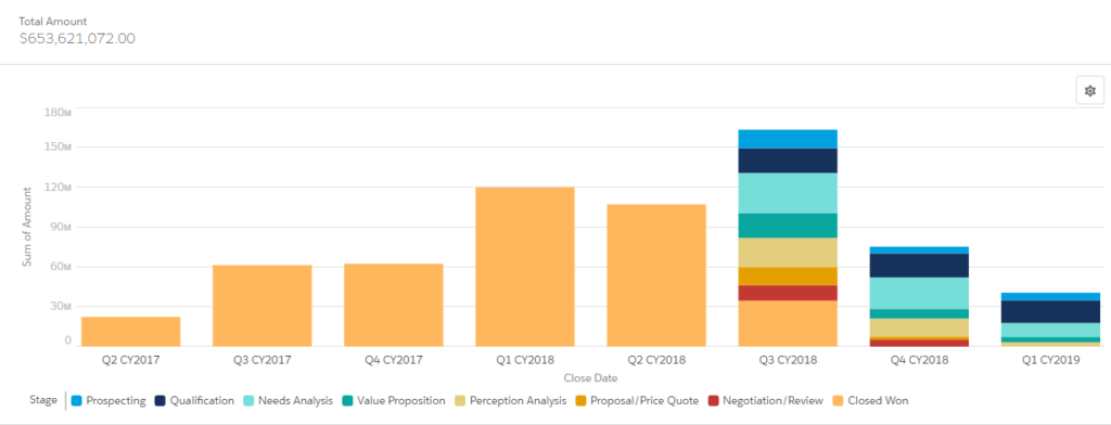
Finally, at the top of the page, click the Toggle Chart button. Select the Stacked Column chart with the following settings:
- X-Axis = Close Date
- Y-Axis = Sum of Amount
- Stack By = Stage
- Legend Position = Bottom
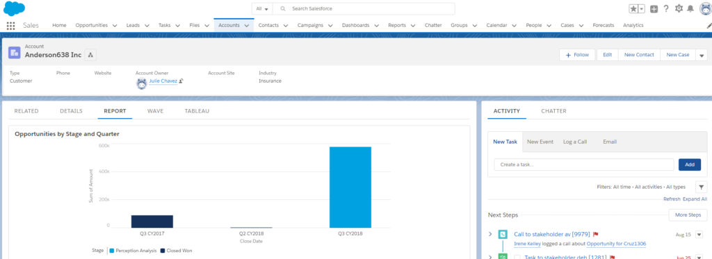
Your chart should look something like this
Save the report and name it “Opportunities by Stage and Quarter”.
Step 2: Embed and Filter the Chart on Salesforce Records in Lightning Experience
It’s helpful to see the opportunity pipeline across all accounts, but what if account managers want to see this chart filtered automatically when looking at a specific account record in Salesforce? To achieve this, we are going to use a standard lighting component that displays and filters the report chart to only show pipeline data specific to the account record being viewed.
Navigate to an Account record in your Salesforce org. Click the gear icon in the top right and select “Edit Page”. This will open the Account Record Page editor in the Lightning App Builder. Click the Tabs (1) component, then the Add Tab (2) button. Select “Report” (3) for the Tab Label.
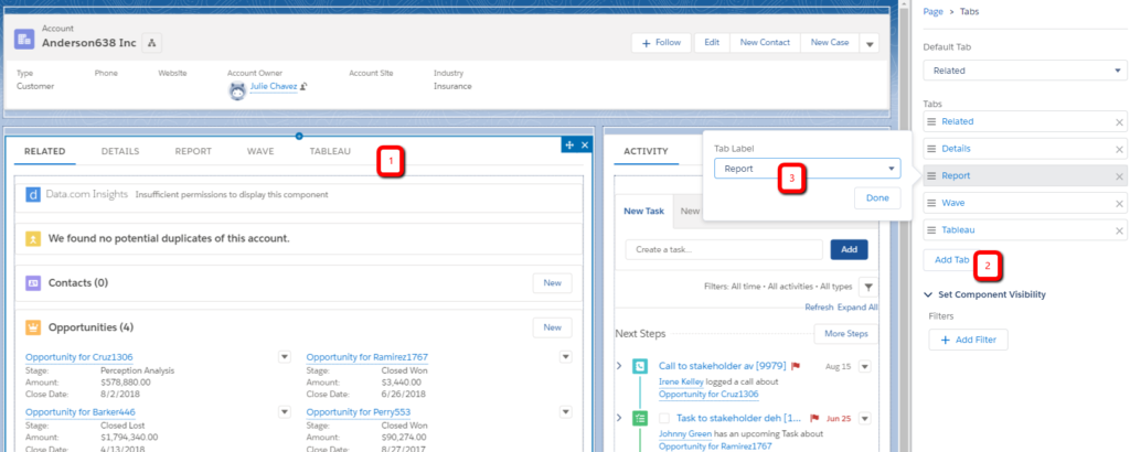
Click the Report tab, then drag the Report Chart component from the list of Lightning Components onto the page. In the right pane, select the “Opportunities by Stage and Quarter” report and “Account ID” in the Filter By setting.
Save the Account Record Page and then view an account record to see the filtered chart.
Summary
Advantages of this approach include:
- Effort and skills required: Salesforce reports are the easiest to learn and use out of all of the solutions we looked at. If your organization is using Salesforce, chances are the skills are already in-house.
- Multiple devices: The standard lighting component used in this example is responsive and looks good on a variety of screen sizes. Custom record page tabs can also be created for the mobile layout, plus report charts can be added to page layouts or compact layouts and be easily exposed in the mobile app UI.
- Single sign-on: Since reports are native to the platform, Salesforce users have access to visualizations automatically.
- Accuracy of data: Salesforce reports query the data in real-time or near real-time so the chart always shows accurate information.
- Data security: Salesforce reports respect object, field and record security defined via user permissions, record ownership and sharing.
- Deployment process: Salesforce reports and folders are supported via change sets and metadata API deployments so can be easily integrated into the Salesforce application development process.
For many use cases, the native Salesforce report and dashboard tools are the best approach. There are several limitations, however, that can lead to the need to consider more robust solutions:
- Look and feel: As of Summer ’18, there are only 8 chart types supported for report charts. There are a few options for customizing the colors and layout of chart elements, but for the most part there isn’t much flexibility.
- Large data volumes: Reports don’t perform well when they are querying large data sets. There are a few ways to improve report performance, but this is a common limitation that leads to implementing a more robust analytics solution.
- Data sources: Reports are limited to analyzing data stored in Salesforce or exposed via External Objects.
- Data model: Relationships between objects are pre-defined via lookup and master-detail relationships and ad-hoc joins or restructuring of the data model is not possible via Salesforce reports.
Next post: Embed Einstein Analytics (Wave) Dashboard in Salesforce Records
Resources
- Salesforce documentation: Report Builder
- Salesforce documentation: Lightning App Builder


